Tuesday, May 1, 2012

The story behind the name


The story behind the name

Why i chose @V4, as the title of my music magazine?
Well it started off as a random combination of punctuation, letters and numbers.
Little did i know it have to have a meaning behind it... when i found this out, i started to panic as i didn't want to have to change my whole magazine so i frantically started looking out for something to do with music with V4 in, then i came across a website, called 'Vision 4 Music' and its a website, so the '@' can represent online. 

Tuesday, April 24, 2012

FINISHED!!!! DPS!!!


FINAL CUTS EVALUATION DOUBLE PAGE SPREAD!

I am pleased with the final cut of my magazine, I have made sure it appeals to the audience i was aiming for, which is both sex's but more towards girls, as it has more gossipy articles, and posters included within the magazine.


The above image shows my double page spread, i am really proud of this, i think its the best part of my magazine, I chose to theme it quite girly, as the artist 'Sophia Mariah' is very girly, and the way i have set it out is based on the artist, as a lot of double page spreads are. The interview, is very cheesy and gossipy as that's what a female audience would like in a music magazine, information, and gossip on the artist. The whole design of the page is so that the artist rubs off on the reader, and that the reader gets an idea of who the artist is, and what she's like.

FINISHED CONTENTS!!!


FINAL CUTS EVALUATION CONTENTS!

I am pleased with the final cut of my magazine, I have made sure it appeals to the audience i was aiming for, which is both sex's but more towards girls, as it has more gossipy articles, and posters included within the magazine.


The above image, shows the final cut of my contents page, it is colourful, and bright, so that the reader is drawn to it. The numbers of pages are bright and whats on them is in bold so that the attention is drawn to which ever artist and page they're looking for. The page is busy but not too busy so that the reader isn't thrown off by how much is on the page. Its not cramped, it all fits. 


FINISHED FRONT PAGE!


INAL CUTS EVALUATION DOUBLE PAGE SPREAD!

I am pleased with the final cut of my magazine, I have made sure it appeals to the audience i was aiming for, which is both sex's but more towards girls, as it has more gossipy articles, and posters included within the magazine.


I think my final hand in of my front cover is good, although i didn't realise i had left the box outlines on, so i'm going to get marks deducted and i might cry, because i was in such a stress i didn't check !!!


Friday, March 23, 2012

Picture timetable

Picture time table -

ALMOST FINISHED!

I have my feed back for my rough cuts and i am now ready to start making improvements to my music magazine. I will hopefully be done by the dead line but, i'm starting to get stressed out as I have a lot to do to my magazine including having to try and fit taking new pictures into my buys busy schedule.

Thursday, March 22, 2012

Rough Cut feed back

Rough Cut Feed Back


I asked my target audience, what they would change about my rough cut. The feed back i got was very helpful as it helped me come out with a rough idea, as to how i would change my rough cut to make it look professional and so that the audience would buy it.

From asking my target audience questions on a video camera, and giving them a questionnaire, i have come up with the ideas for each page. For my front cover, to improve it they have said they would like to see the names of artists all over the front cover, big and bold so they know what is in the magazine. They've also said that i could so with having, something FREE inside, they've said that my bar code needs to look real, so i need to edit that on photo shop. Another thing they have said is that what ever my main story is needs to stand out against the rest, so i plan to put a background colour on my 'Sophia Mariah's' Story.

For my Contents page improvements, i have been told, that it needs to look full, the magazine needs to look as though it has a lot in it. The pictures need to vary, and there needs to be advertisements, to win things, or get something free, from this i plan to improve my contents by putting more, regulars and features on it, along with some advertisements, i plan to take more photos, and fill any blank space with things from example magazines, for example NME.
For my Double page spread feedback i got told to make the page look more realistic, with page numbers, and quotes, I also got told to put the name of the artist on the top of the page so people know who the story is about, and an introduction into the story to see if the reader really wants to read the whole article.


Wednesday, March 21, 2012

Questionnaire Proof


QUESTIONNAIRE


 I am creating a music magazine, for my AS level, could you answer a few simple question specifying what, you like and would want in a music magazine if you were to buy one.

1.        Do you read music magazines?                                Yes                                         No

2.       How old are you?            Under 15                              16-18                                     19+

3.  Which genre of music is your favourite?     
                         
Rnb                Country                Rock                 Indie                 Dub step               Other  

4.        If you chose other on the above question, what genre is it? 

5.       What do you expect in a magazine?

6.       Describe your perfect magazine cover...

 7.       What draws your attention to one magazine over another?

8.       Do you expect established stars in the magazine or new music?

The above is just a few of the questions i asked in my questionnaire towards my target audience. 
Below shows a scan of the filled out versions of my questionnaires, they helped me come up with the conclusions for what my final version of my magazine would look like.


Tuesday, March 20, 2012

Rough Cut front cover

Rough Cut Front Cover

The above picture shows my rough cut of my magazine, the layout is appalling at the moment, I intend to re-arrange everything, and change the front cover picture as its too far towards the left. The triangles on the right hand side do nothing for the magazine. My bar code isn't finished, and needs to be changed. I like the title, and am keeping that, and the 'independent voice, independent music'. I intend to have a picture of 'Sophie' in the middle of my page, and what is in the magazine either side of the photo to make the front cover more full. I'm not changing my model, as my double page spread is of her, but the colour scheme will defiantly be changed, as i don't think it fits together very well.


Rough Cut double page spread

Rough Cut Double Page Spread

The above picture shows my double page spread rough cut, I have a lot of things missing; for example, there's no title, or introduction into the article, and there's no page number on the pages, there's also no quote on my picture page. I like the colour scheme and will keep this, as i think it compliments the picture page well. I have edited two pictures together to make it as though Sophie (my model) is looking at herself; i think this works well as its unusual and different, and no one else will have thought to do this. It goes with the usual style of the magazine, very individual. 

Rough cut contents

Rough Cut Contents

This is my rough cut of my contents page, nothing on it is very clear, and nothing stand out, i don't like the picture on the top right corner of Sophie, i think i have too much of her on my magazine. The colour choice, it too girly, and the purple doesn't sit right on the pink. I haven't got anything on the bottom, for example page numbers, or websites, or advertising for the magazine. There also isn't enough on the contents page, there's far too much white space.

Sunday, March 18, 2012

Starting my Magazine Diary entry 7

Diary entry 7

I now am starting my magazine rough cuts, this will continue my drafts of my magazine, which allows yu to see the stages in which i have developed my magazine. 
I will create my rough cuts based on the information i have found through my research and then save them as JPEGS to my folder in the shared media file. I will then get  teacher feedback along with my own student feedback which will allow me to improve my magazine. 

Saturday, March 17, 2012

Photos- first photo shoot

First Photo Shoot

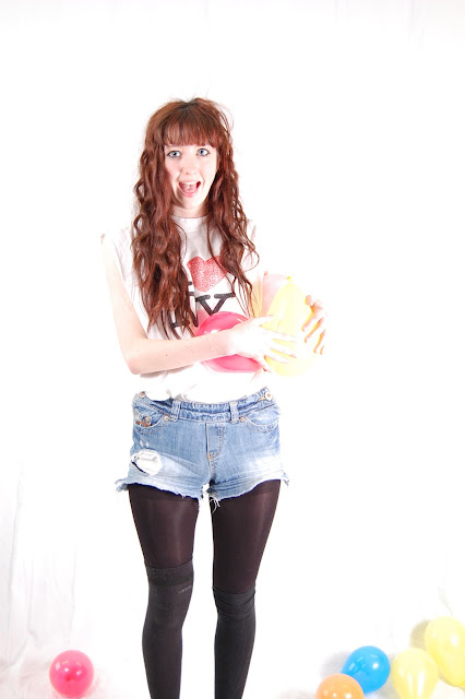
These are some photos from my first photo shoot.


I think the photos that came out of this photo shoot were alright, but people kept walking in and my model 'Sophie' kept moving and laughing.


Friday, March 16, 2012

Diary entry six

Diary entry six

This week i had to plan out my photos and the locations of my photos. 
I decided to plan out my images before picking up the camera, because if i did that i would end up with random shots, that weren't thought about in unsuitable locations.
I had to make a table to plan this out, the table kind of looked like 

Picture     Time and Date    Model/ Pose     Location   Lighting    Set-up    Mise-en-     Camera angle
                                           / costume                                            time       scene          and distance 

1

2

3

Etc etc etc.....


Diary Entry Five Target Audience

Diary Entry Five

This week i have Identified my target audience, I am aiming at the youth of today, more towards girls,  but boys may enjoy the magazine as well. As i intend to include posters, and gossipy interviews with 'artists'.
During this re-search activity i will be making a questionnaire, video interviews with my target audience, quotes and ideas from my audience throughout my blog. From this audio and visual feedback, I will be able to make my magazine the best of my ability.

Thursday, March 15, 2012

Diary Entry four

Diary Entry Four

From my initial ideas i have came up with my initial sketches, i have drawn on paper sketches of my front cover, contents page and double page spread.  I have colours it in to show my colours scheme ideas and it will give the you all a better indication of what the magazine will look like.
This will show my primarily ideas.
I am currently conducting investigations into my initial sketches, and asking my target audience what they think of my ideas.

Tuesday, March 13, 2012

Diary Entry three

Diary Entry three

This week i had to do my initial ideas diagram, this included my first thoughts for the project, this includes genre, style, brand image, target audience, photos, colours, and stories.
I made a mind map of what i liked on magazines, and what i intend to take into account when making my own. My mind map is very varied, which allows me to changed my mind on certain things, and lets my ideas go WILD!

Sunday, March 4, 2012

Initial Ideas Diagram

Initial ideas diagram


This is my initial ideas diagram, it shows how i have thought about the magazines i have investigated and how mine will challenge and develop media conversions, as the plan for my magazine is so that it is individual and unique.


Initial Ideas


Saturday, March 3, 2012

Diary Entry Two


Diary Entry two – MEDIA


This week I started my music magazine project, I had to research existing music magazines; I needed to take note of what music magazines looked like, so that I could design one similar. I then researched the codes and conventions of the music magazines, for example they all have barcodes, and the title of their magazine at the top of the page. This included the codes and conventions of front pages, double page spreads and contents pages.  I have been looking through magazines to find a style model, this has to be based on a specific genre, I analysed the codes and conventions, so that I could make my magazine similar.

Thursday, March 1, 2012

Contents evaluation Q magazine

Contents page Q magazine evaluation


The logo and name of the magazine is in the corner of the page. which makes the magazine become more subtle, as the front cover has been designed so that the reader becomes aware of the name of the magazine.
Although James Blunt is the main image in this contents page, his name is placed second so that people become aware of what else is in the magazine, other than the huge image of James Blunt. Because by having him there it is quite obvious that he is included in this issue of the magazine.
There is also a separate section on the contents for the re- occurring things in the magazine... for example every month the magazine puts in a quiz or question ad answer, or posters; In this case 'cash for questions'.


Contents page Evaluation vibe magazine

Contents page Evaluation Vibe magazine


The word contents is presented differently, and slightly strange to made it unique and stand out more. The unique way that they have the model lying on the floor changes the whole look of a usual contents page. I like the way they have tried to but the 'V' in the back ground not noticeably but they have put it in for 'vibe' magazine. I like how neutral the contents page is, and the way it fades from black to white, from top to bottom.

Front cover evaluation vibe magazine

Front cover evaluation


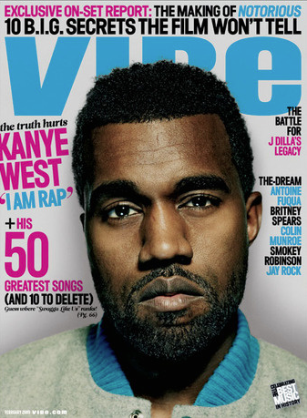
This is a front cover for VIBE magazine, i like the colours used as i think the brighter the colours the more appealing the magazine to the audience its intended for, by using bright colours it kind of letter the image fade into the background is the image isn't too in yours face that it just distracts you from what is in the magazine.
The magazine front cover shows what is features in the magazine and one main story which in this case is Kanye West ' i'm a rap', it also has a linked website in the bottom left hand corner.

Evaluation 3 Double page spread

Evaluations of double page spreads


This double page spread is from Vibe magazine, of an R&B/Hip Hop genre. This double page spread is very different to Kerrang magazine. Kerrang magazine had very little text with lots of large images, whereas Vibe magazine has lots of text but with several images too. The overall colour scheme is quite plain, using only black, white and blue. Using these neutral colours appeals to both a male and female audience of all ages, which can help increase the magazines fanbase. Solange Knowles is wearing a short orange dress with high heels. This image accepts the body image importance stereotype within the R&B/Hip Hop music genre. Solange wearing an orange dress enables her to stand out and be the main focus, as does her name being printed in bright blue. With lots of text and pictures, it shows that Vibe magazine intend on educating readers and entertaining them too.

Front cover evaluation Spin Magazine


Front cover Evaluation


This is a front cover for Spin magazine, is features the band 'Paramore' but by having only Hayley Williams on the front, appeals more to the audiences, as shes an idol to a lot of young girls who like that genre of music, as well as boys finding her attractive. I will use this in my magazine because by placing a 'good looking girl' on the front it will attract both boys and girls because girls will aspire to be like her where as boys will buy the magazine for the posters and pictures inside.

Front cover Evaluation Q magazine

Front cover Evaluation


This front cover, is appealing to both genders, as i think that since it's having Cheryl Cole on it, its appealing to girls because it's Cheryl and shes an idol to all young girls, and boys because she looks slightly sexual, she has a very precognitive look to her.

The front cover includes a motto on the front of the magazine along with advertisements down both sides of the magazine, and a huge title indicating Cheryl Cole is featured in this issue of the magazine. The magazine also has a wet look to it which makes Cheryl look more and more appealing to a male audience.

Double page spread evaluation Kerrang

Double Page Spread Kerrang


This double page spread is from Kerrang magazine, of an Rock/ screamo genre. This double page spread is very different to any of the other magazines i'm evaluating. for example Q magazine had loads of very little text with one large image, whereas Kerrang magazine has very little text but with one huge image. The overall colour scheme is quite very vibrant, using a number of various bright colours. Using these vibrant colours appeals to both a male and female audience of all ages, which can help increase the magazines fan base. My chemical romance are dressed in bright colours with corresponding jackets. This image is completely different to a usual stereotype in this genre, as usually they'd all be dressed in dark clothing, black preferably.  MCR wearing these bright outfits enables them to stand out and be the main focus. With lots of text and pictures, it shows that Kerrang magazine intend on entertaining readers.

Evaluation Double Page spread Q

Evaluations of double page spreads


This Double page spread is very attractive to the reader, The large L draws you in as well as the image, i think the image being in black and white shows the magazine off more than the artist as Lady Gaga is anything but plain. The magazine defiantly tones her down. The large L is there as that's the first letter of her name. This draws the reader in to find out who it is whom they are reading about.
the double page spread has a the magazine logo in the bottom as well as the date and a page number. 
The language used is very formal, as they're not talking to gaga during the interview, they're talking about gaga in a recent interview and including a few quotes but not as much as face to face interview.
The Picture takes up more of the page than the writing does, and At the start of a new topic they capitalize, bolden and over size their first letter.


Evaluation Double page Spread 2

Evaluations of double page spreads


This Double page spread is very attractive to the reader, its bright, and stands out! by using yellow against the red of Rhianna's hair, allows the title to stand out against the background as they're opposite colours. Also by having a cut down the side of the double page spread showing Rhianna throughout the years gives the reader and option as to what to read on the page.